PROJECT_01Data pipeline and interactive visualization
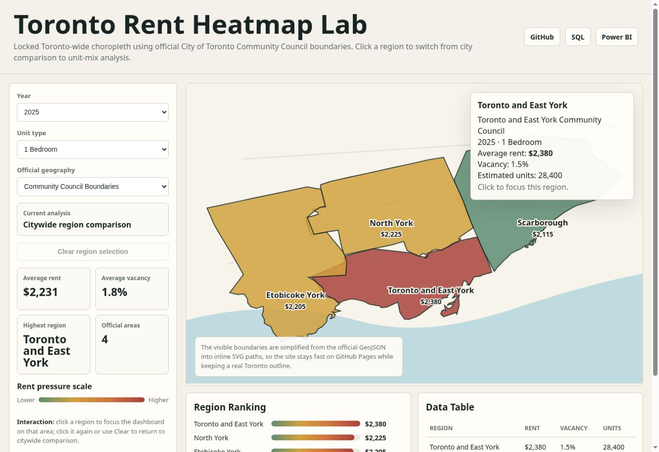 LIVE MAP ↗
Toronto Rent Heatmap Lab
A city data workflow and interactive map prototype for comparing rent pressure across Toronto.
WHAT I BUILT
- Built a Python workflow for data extraction, transformation, and loading from normalized and CMHC style tables, including handling for suppressed rent values.
- Designed a SQL dimensional model and Power BI ready exports for rent, vacancy, unit count, geography, and year.
- Built a GitHub Pages choropleth with official City of Toronto Community Council boundaries. The current map uses sample rent values.